Built Shelter's design system from scratch, cutting dev time by 50%
Every team was recreating inconsistent components. Designers and developers across Shelter were recreating identical components for every project. No shared standards, no reusable code—just wasted time and inconsistent interfaces.
I researched the best systems and adapted them for Shelter. Studied IBM, Material, Clarity, and Adobe's design systems to find patterns that fit our needs. I partnered with engineering to design and build reusable components across React, Angular, and vanilla web.
Impact:
50% reduction in dev task time
First unified design system at Shelter
Now used across all internal and customer-facing products
Shelter Insurance didn't have a design system.
Designers recreated the same components for every project, engineers built duplicate code, and insurance customers navigated inconsistent interfaces.
Visual inconsistencies across Shelter's digital products:

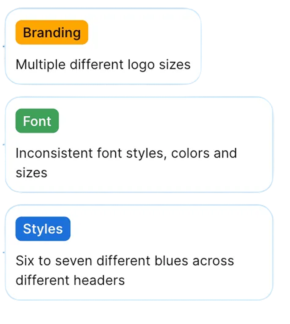
Brand inconsistency across channels: Shelter Insurance's print materials and digital assets followed different styles, varying in color palette, typography, and logo treatments, resulting in inconsistencies in the overall brand experience.
Development inefficiency: Each team spent 9-10 hours per week recreating buttons, forms, and navigation components that already existed elsewhere—time that could have been invested in building new customer-facing features.
Fragmented customer experience: Varying button styles, typography, and layouts across pages created a disjointed digital ecosystem that didn't reflect Shelter's strong brand standards.
These inconsistencies slowed product development, fragmented Shelter's brand identity, and created a digital experience that didn't match the quality of Shelter's insurance products.
Learning from IBM, Material, and Adobe: choosing the right foundation
Evaluating proven design systems to find Shelter's path
Before building Shelter's design system, I needed to understand what already worked at enterprise scale. I analyzed five established design systems, each chosen for specific reasons:
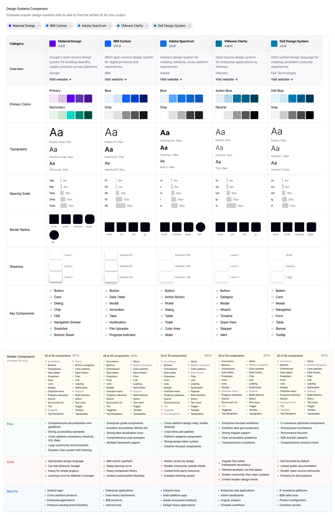
The winner: Material Design as our foundation
Why these five systems:
IBM Carbon - Enterprise-scale documentation and governance model; proven in insurance/finance industries
Material Design (Google) - Comprehensive component library with strong multi-framework support (React, Angular, Web Components)
Clarity (VMware) - Enterprise application focus with data-dense interface patterns
Dell Design System - Multi-brand consistency approaches for organizations with varied product lines
Adobe Spectrum - Accessibility-first methodology and comprehensive design token architecture
I selected Material Design as Shelter's architectural foundation because:
Multi-framework support across React, Angular, and vanilla web
User familiarity—customers already know Google's component patterns
Extensive documentation and examples to learn from
Wide range of base components (50+) to build upon
However, we didn't rely on Material's defaults. I customized the system to Shelter's brand by adapting colors, typography, and component styling, while building accessibility into each component.
Building accessible, reusable components
With Material Design as our foundation, I partnered with developers to design and build a comprehensive component library that would work across React, Angular, and vanilla web.
From wireframes to production-ready components
I began with low-fidelity wireframes to establish component hierarchy and patterns, working closely with developers to validate technical feasibility and identify which components would deliver the most value.

Hand drawn sketches
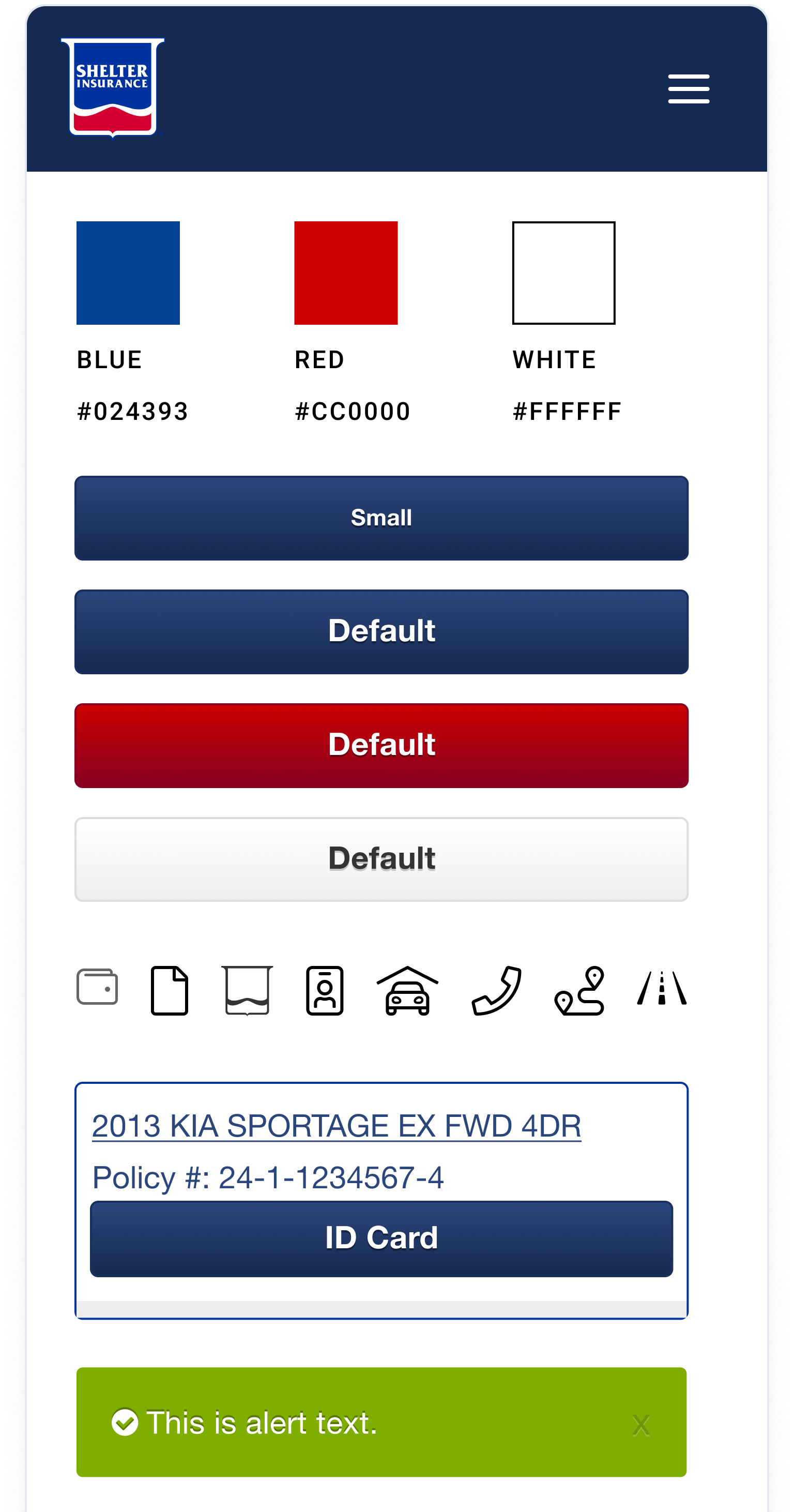
Before:
Key improvements included:

Low-fidelity component library
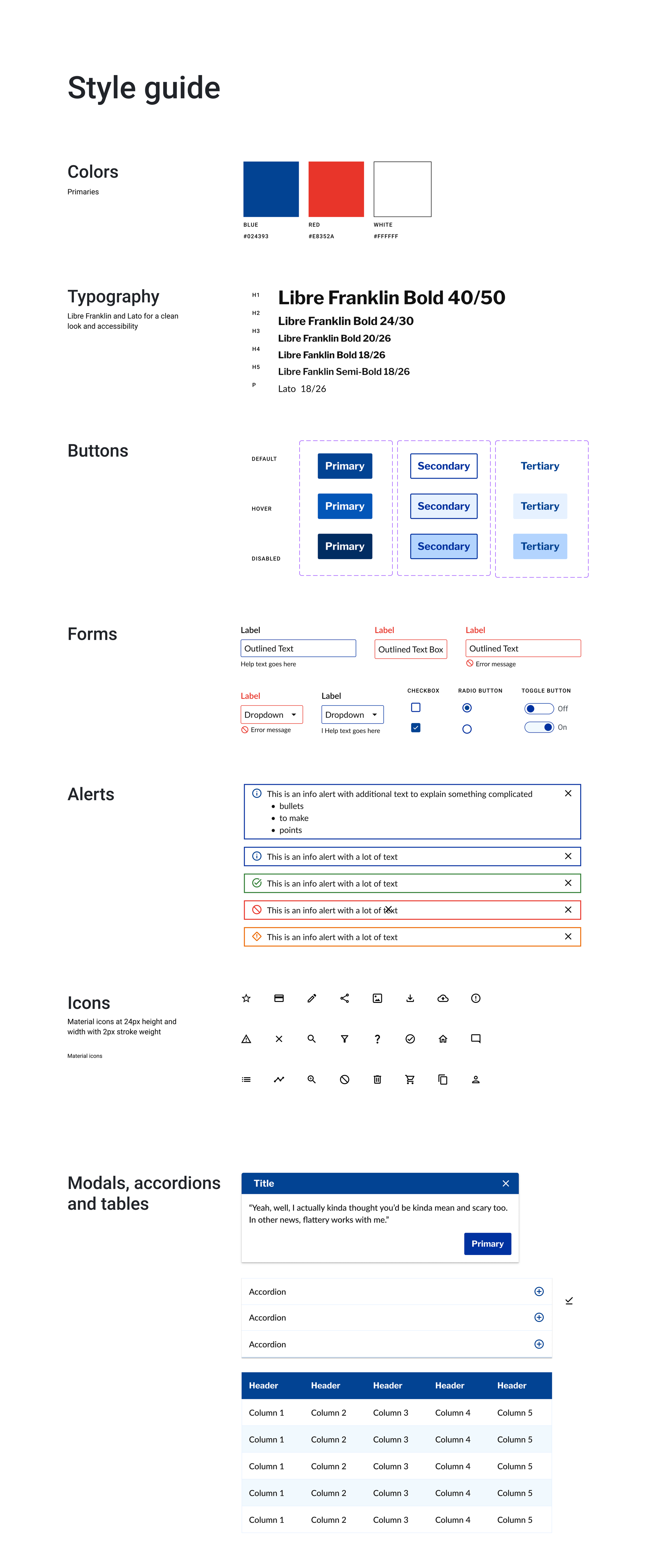
High-fidelity style guide
These hand-drawn wireframes evolved into digital components through close collaboration with engineering teams. The low-fidelity component library (center) translated sketches into basic patterns—establishing button hierarchy, form structures, navigation systems, and layout grids—allowing developers to validate technical feasibility before adding visual polish.
These basic components were then refined into the final style guide, which established Shelter's brand palette, typography (Libre Franklin Bold), and standardized form patterns—all refined through developer feedback, accessibility testing, and brand alignment.
Transforming inconsistent patterns into a unified system
The design system transformed Shelter's fragmented digital experience into a cohesive, accessible system.
After:
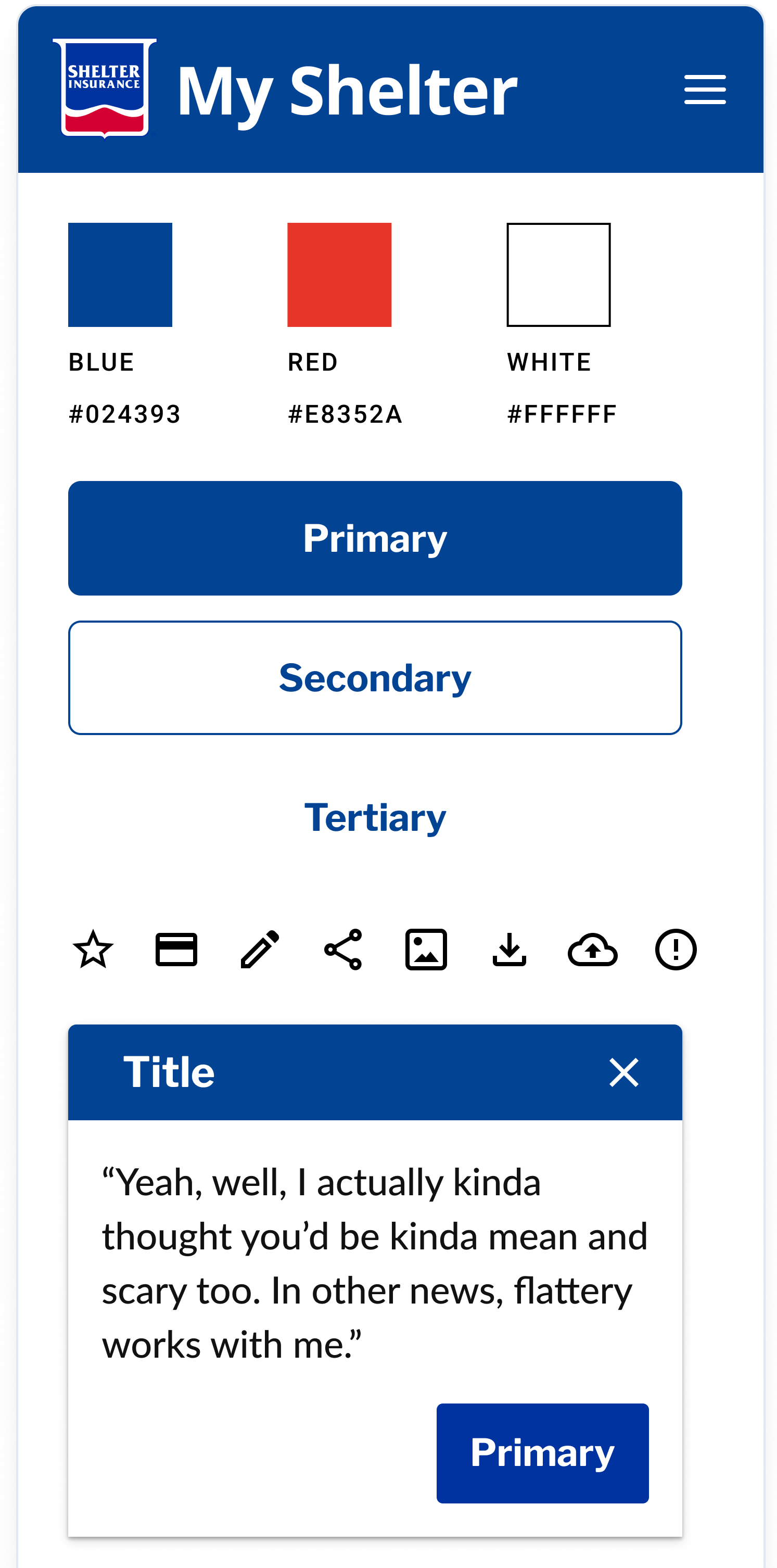
Clear branding:
Added "My Shelter" text to the header for immediate brand recognition and user orientation
Refined color palette:
Updated red from
#CC0000to#E8352Afor better accessibility and brand consistencyMaintained Shelter Blue (
#024393) and white as the core palette
Semantic button hierarchy:
Replaced vague labels (Small, Default) with clear semantic naming (Primary, Secondary, Tertiary)
Established visual hierarchy through filled buttons for primary actions, outlined for secondary, text-only for tertiary
Standardized components:
Created a reusable modal pattern with a consistent header, close button, and action placement
Unified icon system with consistent sizing and visual weight
Established component naming conventions for easier implementation
Design system in action
The design system was applied across Shelter's digital products, transforming fragmented experiences into cohesive, accessible tools for insurance customers. Here's how it improved three critical customer touchpoints
From prototype to production: validating the system
Real-life application
DS components prototype
Interactive prototypes built with design system components allowed us to validate patterns with stakeholders and policyholders before development began. This prototype-to-production approach ensured the system worked in real-world scenarios while accelerating development
Customer dashboard: Improving navigation and clarity
The dashboard redesign demonstrates how the design system's standardized components created a more intuitive customer experience.
Before:

After:
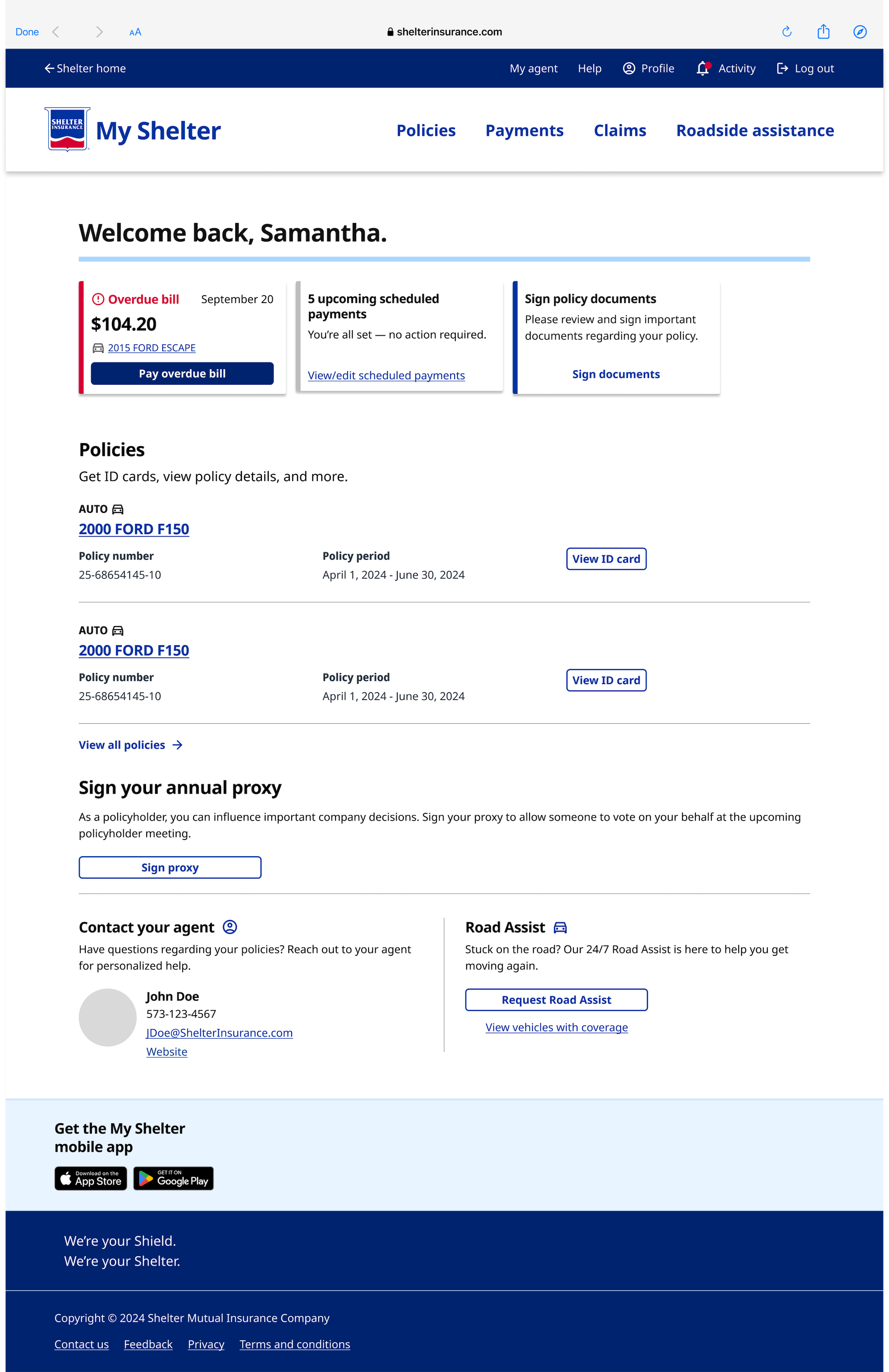
Previous features:
Relied on page-level alerts
Red buttons created friction
Poor hierarchy
New features:
Card-based messaging
Improved top navigation
clear call-to-action
Strong content hierarchy that enhances usability and clarity
These examples demonstrate how the design system transformed both new and existing products—creating consistency, improving usability, and accelerating development across Shelter's digital ecosystem.
Impacts and outcomes
50% reduction in development time
5 products launched using the design system
Streamlined design-to-development handoff through standardized documentation and reusable components
Established a consistent brand experience across customer-facing products and internal tools