Led end-to-end UX and visual design for Iron Diner’s live action game system
Iron Diner is a live‑action multiplayer game set inside a physical 1950s diner, where players complete real actions under time pressure and watch their results play out across a network of connected digital screens.
The game is built around a simple but technically complex idea: a physical cup becomes a data point. Players carry RFID-chipped cups through the diner, collecting ingredients at physical stations. Every cup tap triggers a live update across three screens at once: the station screen, the solo player screen, and the ensemble display showing each team's progress.
Led a team of three UX designers and owned system‑level experience design, including the design system and the ensemble screens consisting of two 60" televisions that serve as the visual command center for each team.
Scope:
3 screen types designed simultaneously
2 brand identities unified within one design system
Metrics to follow post-launch.
Chaos in the kitchen, clarity on the screens
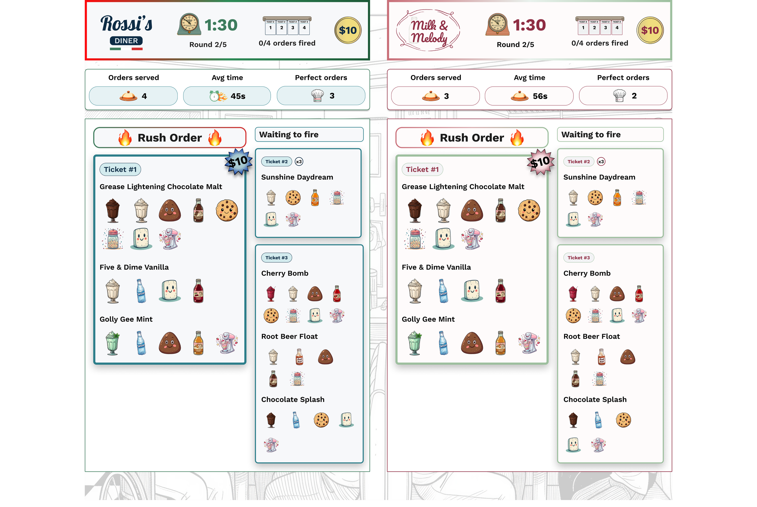
The challenge wasn’t designing three separate screens, it was designing one coherent system that worked across all of them. Every time a player collected an ingredient, three different displays had to respond instantly and correctly: a station screen confirming the action, a solo player screen tracking team progress, and two 60" ensemble displays serving as the command center for the room. One wrong signal anywhere, and the whole experience fell apart.
This wasn't a typical digital design problem. Most interfaces exist in one place and respond to one person at a time. Iron Diner required a shared information model, a single source of truth that could translate across screen sizes, player roles, and a physical environment where the real action was happening away from the screens.
To find the right references, I looked beyond traditional UI. Digital games like Overcooked showed how teams process shared information under time pressure. Escape rooms showed how physical spaces can drive digital feedback, and how players instinctively read their environment for cues when stakes are high.
The hardest part wasn't any single interface. It was the invisible connective tissue holding them together.
Overcooked
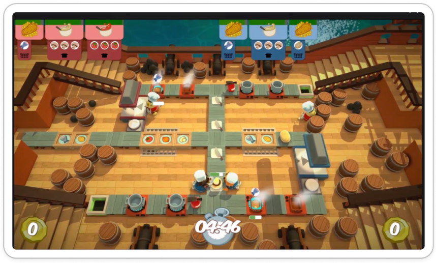
A fully digital multiplayer game with the same core makeup as Iron Diner: teams, timed rounds, and recipes to complete. Used as a reference for how ensemble gameplay communicates shared goals and time pressure on screen.
Coffee Rush
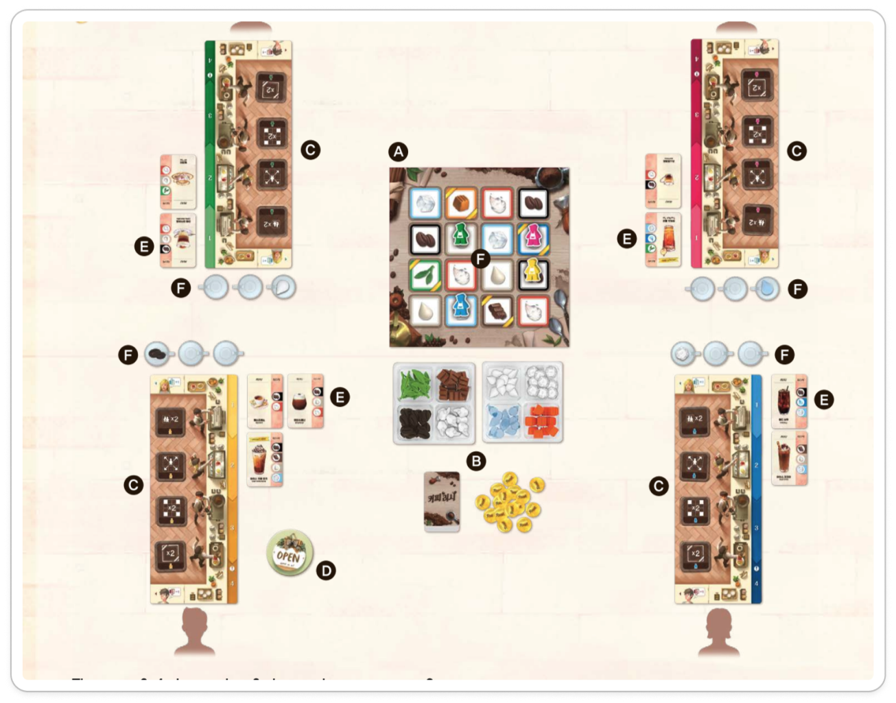
A physical, competitive board game where each player has their own board. Informed how players track their own progress independently while still competing in a shared space.
Merge Cooking
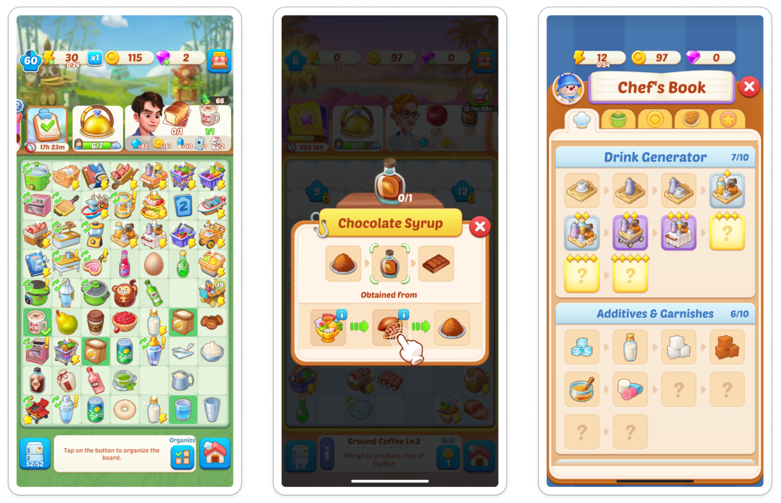
A mobile game where players complete recipes for points, with bonus scoring for high-priority orders. Informed how to visually signal ingredient requirements, progress indicators, and point incentives to players at a glance.
The wireframes didn't just show the screens, they revealed the system
Before anything could be designed, the system had to be understood. Anthony brought the vision. My job was to translate it into design decisions the team could build from, which meant keeping our process lean, staying aligned through email and sprint check-ins, and moving fast in FigJam.
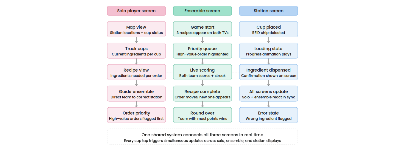
What made this project different from anything I've designed before was that it wasn't just a digital experience. A physical cup becomes a data point. A player places the cup on a station, and three screens must respond simultaneously. Before we could wireframe anything, we had to answer one question:
When do all three screens need to say the same thing, and when does each one need to tell its own story?
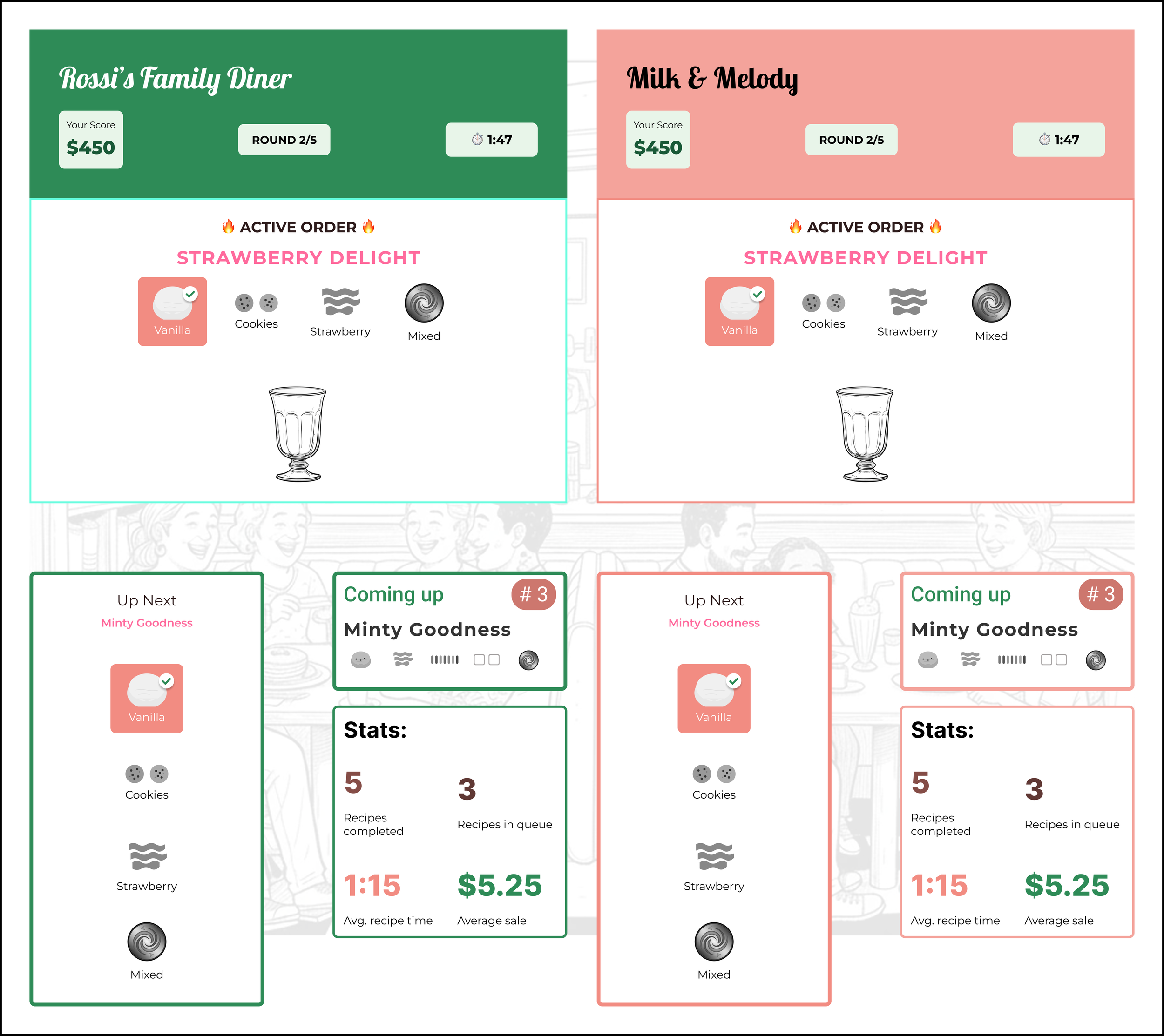
The ensemble player needs the full recipe picture. The solo player needs to track teammates and guide them to the right stations. The station player needs immediate confirmation: what's available, whether the station is in service, and whether the cup is filled.
Wireframes gave me a way to test each answer before committing to visual design. Gamers told me whether the screens made instinctive sense under pressure. Developers told me whether the layouts would render correctly on 60" displays.
Ensemble screens: Early layout exploration showing side-by-side TVs as the clearest format for two competing teams, confirmed through gamer feedback.
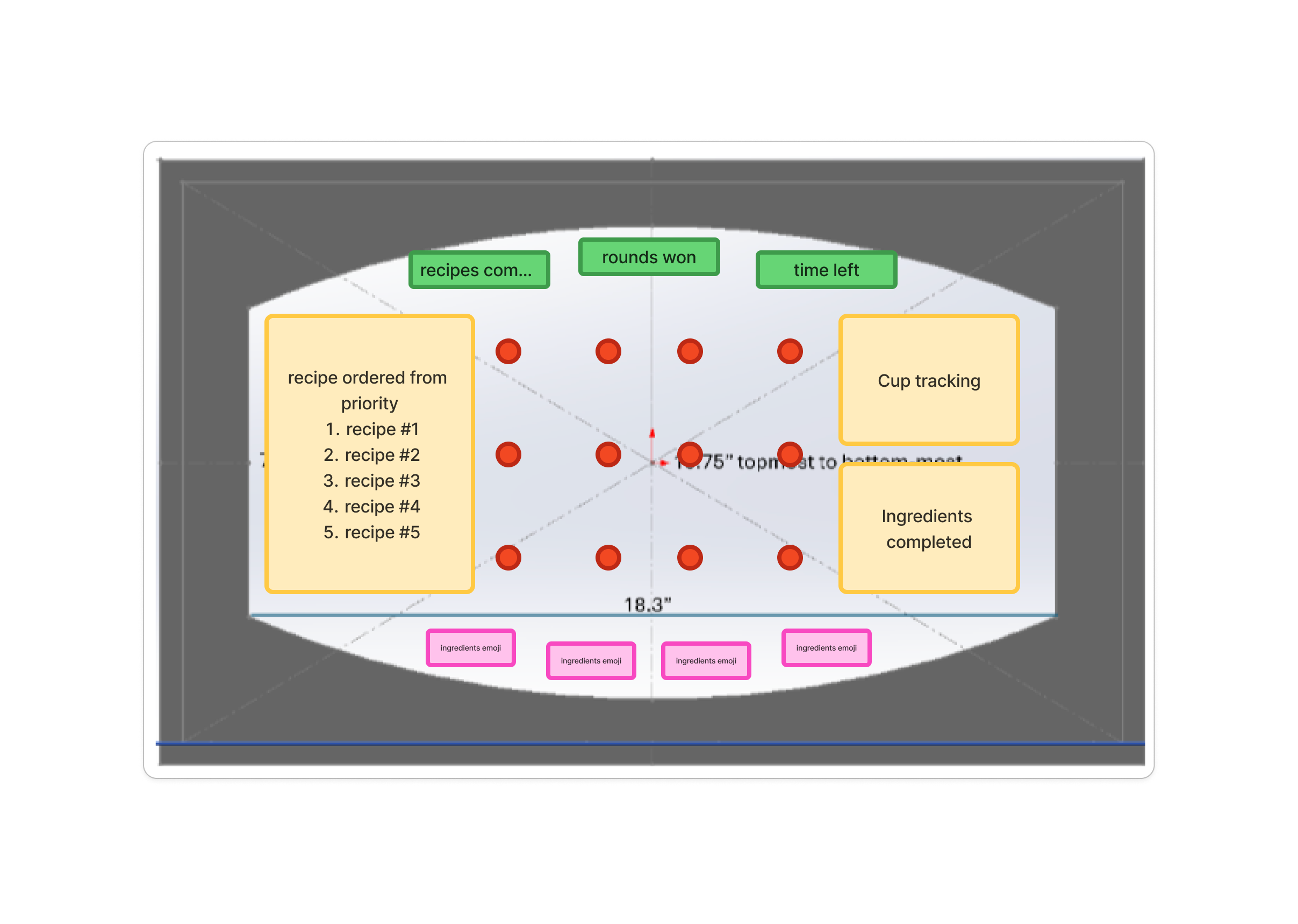
Solo player screen: Early layout exploration showing recipe priority queue, cup tracking, and completed ingredients. Design by Zoe Chang.
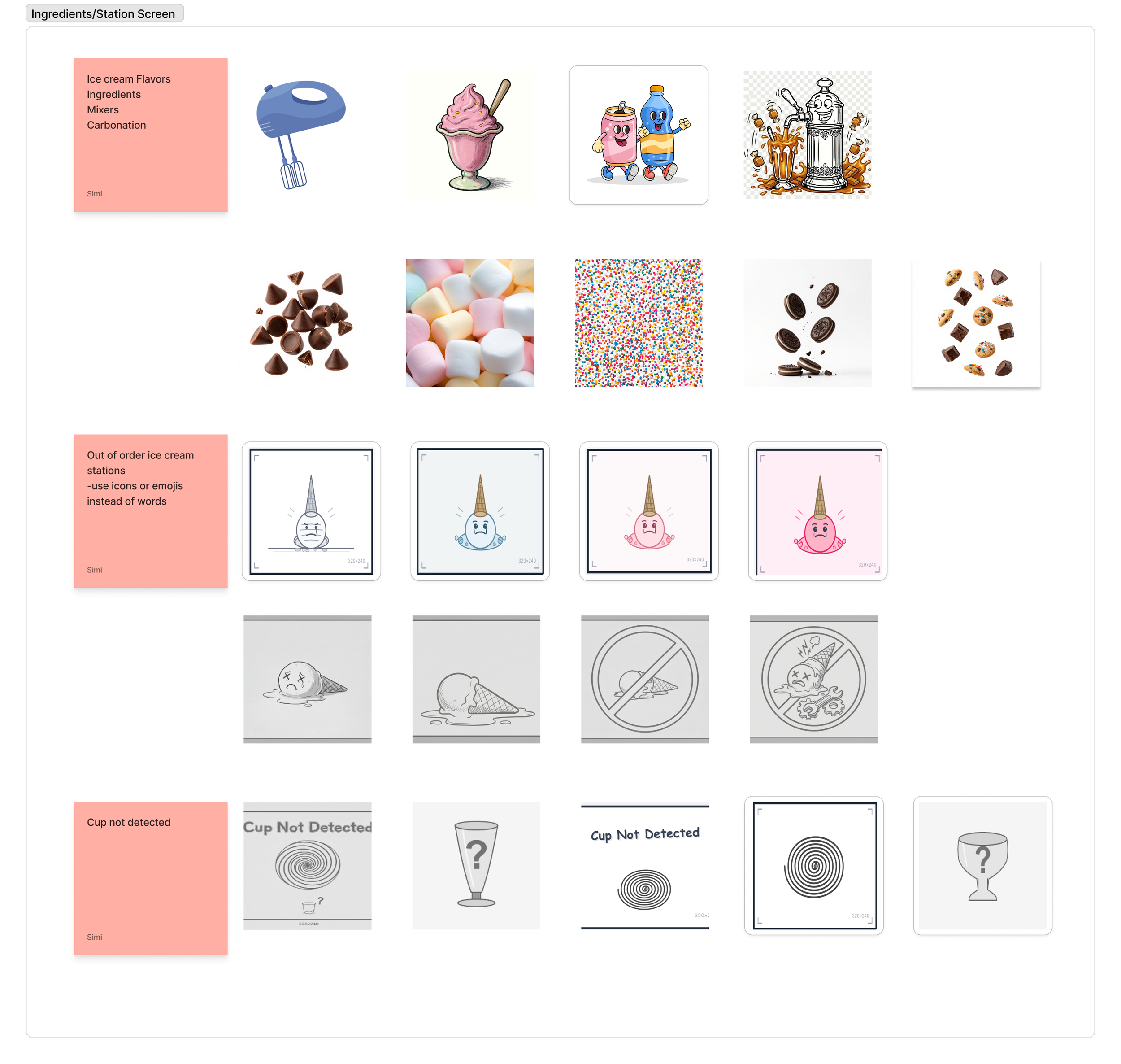
Station Screens: Icon explorations for the station screen covering ingredient categories, error states, and cup detection. Designs by Simi Kohad.
From structure to screens: designing for pressure
The ensemble screens were the visual command center with two 60" TVs showing recipes, scores, timers, and team progress, all readable from across the room. Anthony wanted to see how the UI would hold up against a live environment, so I mocked up the screens with a background image to test visual clarity in context. The solo player and station screens supported different moments in the game.
Players aren't sitting at a desk, they're moving through a physical space, carrying cups, working under a five-minute timer. Everything on screen had to register at a glance from across the room.
The high-priority recipe needed to stand out immediately. Added ingredients needed a clear confirmation. Error states, missed ingredients, unfulfilled orders had to be obvious without stopping the game. Static screens can't communicate any of that, so animation handled the state changes: an ingredient locking in, a recipe completing and cycling out, a streak building.
Game start
Order up
Two competing teams also meant two brand identities sharing the same display. Each team needed to feel distinct without the screen becoming chaotic.
Building brands that share a stage, a system, and a story
Anthony had a full backstory for each diner. Rossi's Family Diner and Milk & Melody weren't just team names; they were characters. I needed to translate that into two visual identities that felt distinct on their own screens but still read as one cohesive game when the two 60" displays sat side by side.
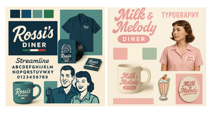
Anthony gave me the personality of each diner and the 1950s retro feel he wanted. I explored color and typography directions that could carry that personality while staying accessible. Every color choice had to meet WCAG AA contrast requirements, especially on large-format screens where lighting conditions aren't always predictable.
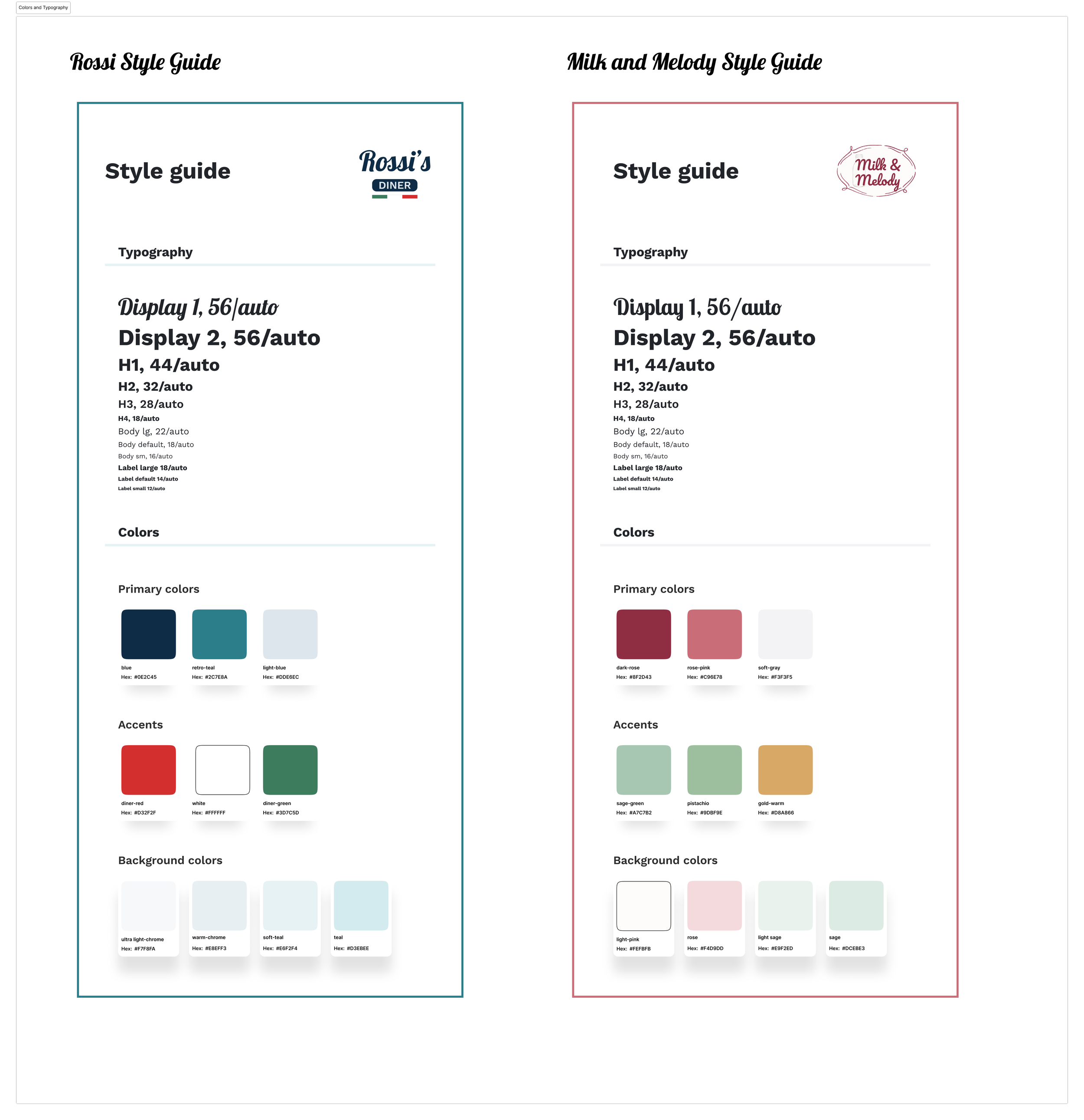
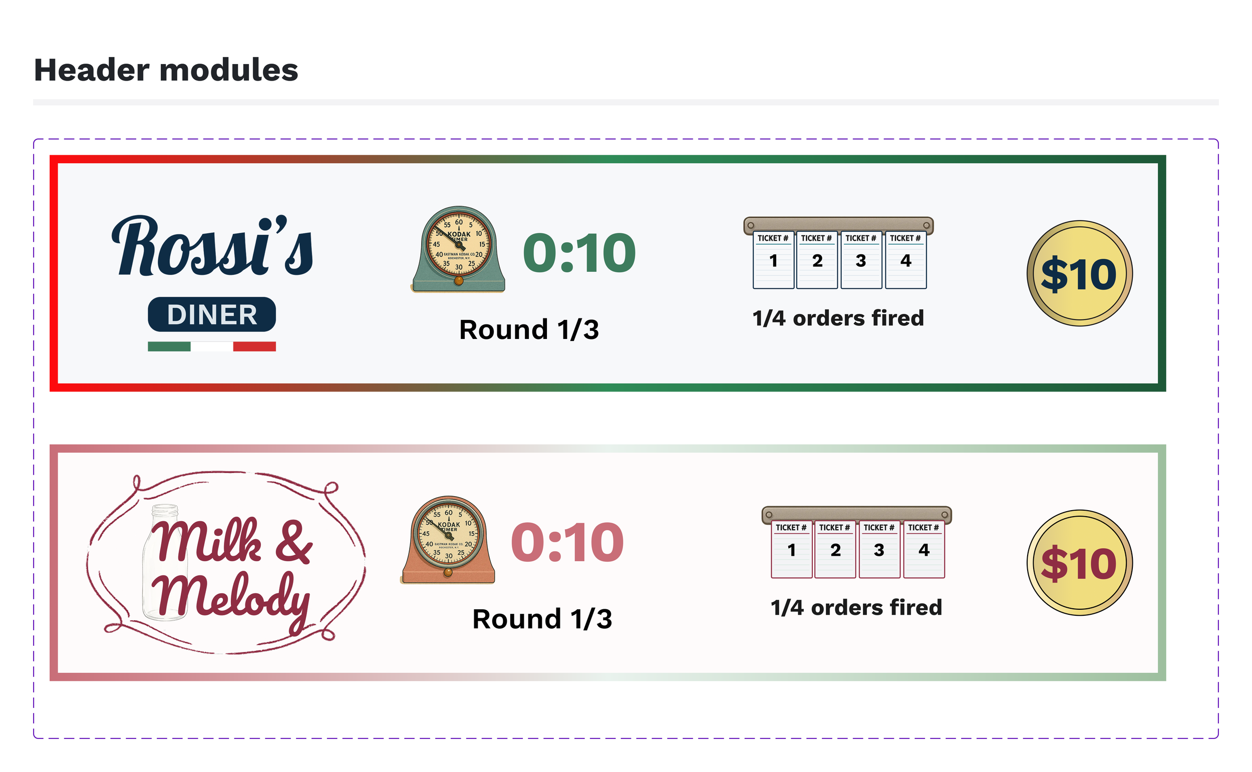
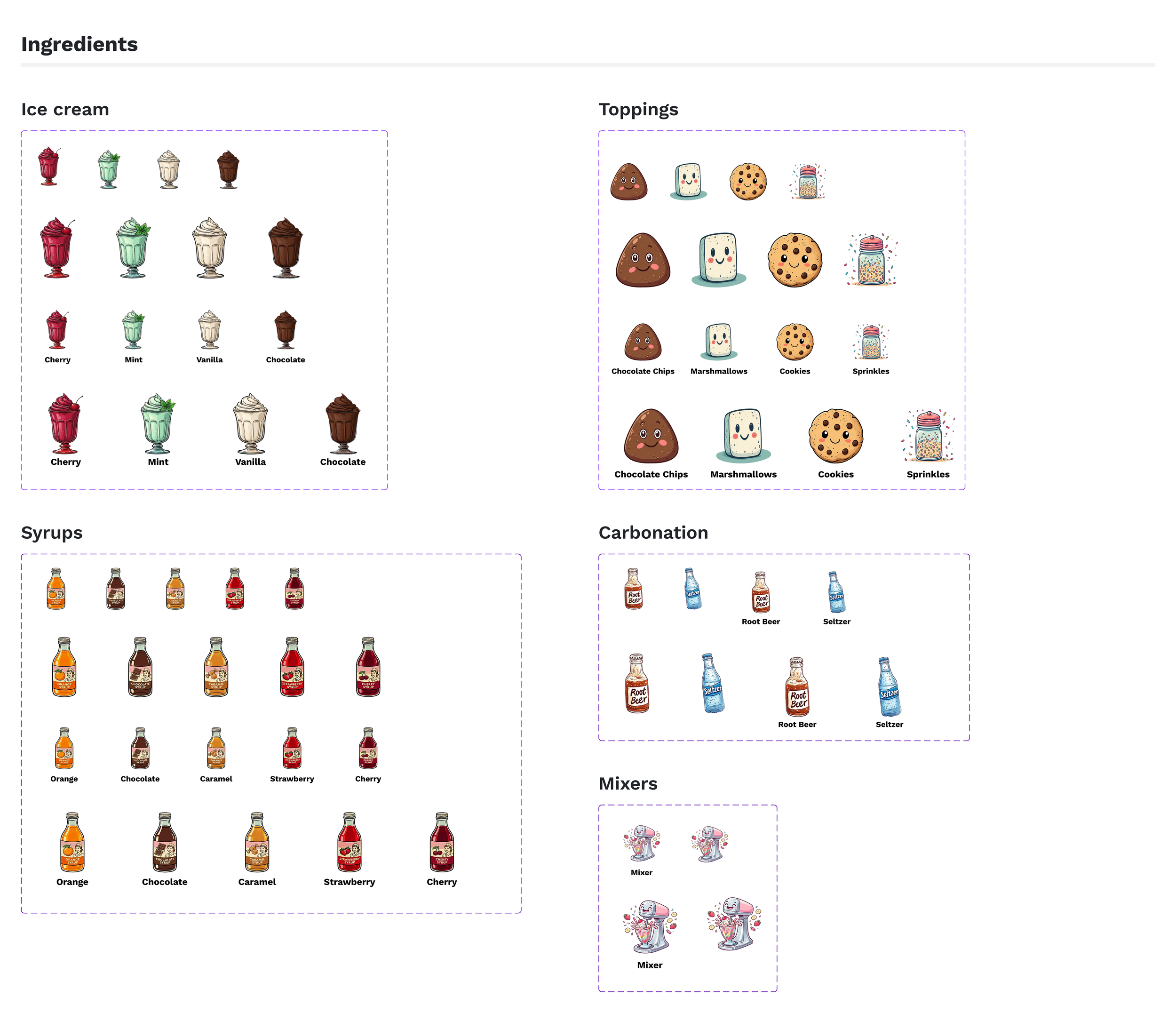
From there, I built out the component library:
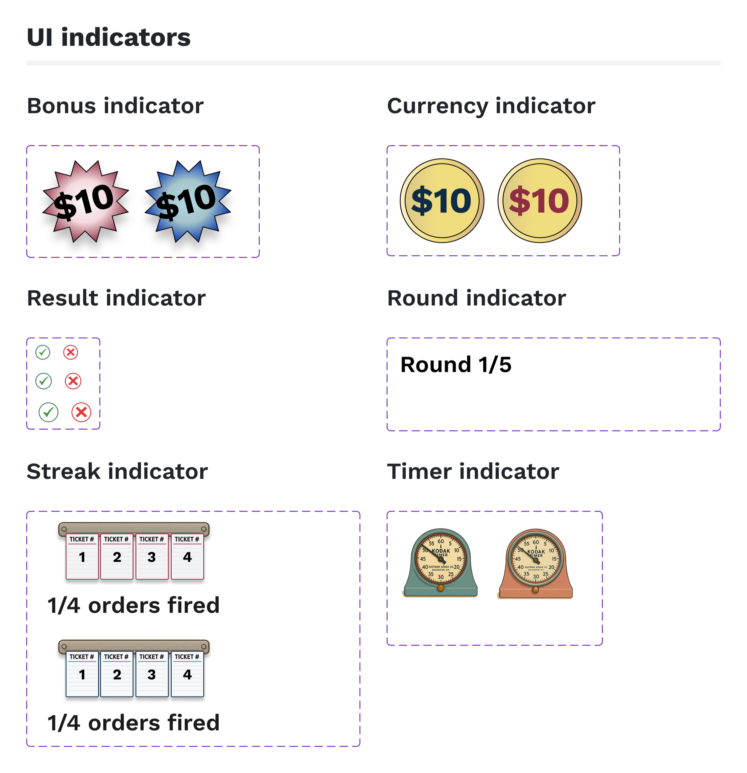
UI indicators
Ingredients (icon designs by Simi Kohad)
Header modules
Patterns
This provided the team with a shared set of assets to work from across screen types.
Future testing through soft opening
Stakeholder feedback
The two brand identities read as distinct without clashing
Recipe hierarchy made sense at a glance
Ensemble displays held the full game state without feeling overwhelming.
Development handoff
Figma files and components were handed off to developers
The game is heading to a soft opening in Philadelphia in April
Tracking post launch
How will players actually move through the space?
Will the information hierarchy hold up under real-time pressure?
How will the feedback animations land when the room is loud, and the timer is running?
These answers will shape the future of Iron Diner.